Categories
CSS HTML

How to Create a Responsive Email Template: A Comprehensive Guide

In today’s digital world, having a strong online presence is crucial for businesses of all sizes. And one important aspect of that presence is email marketing. An effective email marketing campaign can help you reach a wider audience, build customer relationships, and drive sales.

However, with more and more people accessing emails on their smartphones and other mobile devices, it’s essential to have a responsive email template that looks good and functions properly on any device. In this article, we’ll explain what a responsive email template is and how to create one from scratch.

What is a responsive email template?

A responsive email template is a design that automatically adjusts to fit the screen size and resolution of the device it’s being viewed on. This means that no matter whether someone is reading your email on their desktop computer, tablet, or smartphone, the layout and content will look great and be easy to read.

Why is a responsive email template important?

There are several reasons why a responsive email template is essential for your email marketing campaigns:

  1. Mobile usage is on the rise: More and more people are accessing the internet on their mobile devices, and this trend is only expected to continue. In fact, over half of all emails are opened on a mobile device, so it’s essential to ensure that your emails look good and function properly on these devices.
  2. Increased engagement and conversions: A responsive email template can help increase engagement and conversions. When someone opens your email on their mobile device and the layout is easy to read and navigate, they’re more likely to engage with your content and take the desired action (such as making a purchase or signing up for your newsletter).
  3. Better user experience: A responsive email template provides a better user experience for your subscribers. When they can easily read and interact with your email on their mobile device, they’re more likely to stay subscribed to your emails and continue engaging with your brand.

How to create a responsive email template

Now that you understand the importance of a responsive email template, let’s go over the steps for creating one from scratch.

Choose a layout

The first step in creating a responsive email template is to choose a layout that will work well on any device. There are several options to choose from, including a single-column layout, a two-column layout, and a hybrid layout.

A single-column layout is the most straightforward option and is the easiest to make responsive. This layout consists of a single column of content that adjusts to the width of the screen.

A two-column layout is a bit more complex, but it can be effective for emails that include a lot of content or images. This layout consists of two columns, with the left column typically being used for navigation or other secondary content, and the right column being used for the main content.

A hybrid layout is a combination of the single-column and two-column layouts. This layout consists of a single column of content with one or more “modules” (or boxes) of content stacked on top of each other.

Design the template

Once you’ve chosen a layout, the next step is to design the template. This involves deciding on the overall look and feel of the email, including the color scheme, font choices, and any images or graphics you want to include.

There are a few best practices to keep in mind when designing your email template:

  • Keep it simple: Avoid using too many fonts, colors, or images, as this can make the email look cluttered and overwhelming.
  • Use a consistent color scheme: Choose a few colors that complement each other and stick with them throughout the email. This helps create a cohesive look and feel.

Test and optimize

Before you send out your email to your subscribers, it’s essential to test and optimize it to ensure it looks and functions properly on all devices. There are several tools you can use to do this, including:

  • Email on Acid: This tool allows you to test your email across various email clients and devices to ensure it looks and functions as expected.
  • Litmus: This tool offers similar testing capabilities as Email on Acid, including the ability to test on various email clients and devices.
  • Responsive design testing tool: This tool allows you to see how your email will look on various screen sizes, including desktop, tablet, and smartphone.

By testing and optimizing your email template, you can ensure that it looks great and functions properly on any device, improving the user experience for your subscribers and increasing the chances of engagement and conversions.

Use media queries

Media queries are a crucial aspect of creating a responsive email template. They allow you to specify different styles for different screen sizes and resolutions, ensuring that your email looks and functions as intended on any device.

To use media queries in your email template, you’ll need to include a bit of HTML and CSS code. For example, the following code specifies that the font size should be 18px for screens with a width of 600px or more, and 14px for screens with a width less than 600px:

@media only screen and (max-width: 600px) {
  h1 {
    font-size: 14px;
  }
}

@media only screen and (min-width: 601px) {
  h1 {
    font-size: 18px;
  }
}

By using media queries, you can ensure that your email looks and functions as intended on any device, improving the user experience for your subscribers and increasing the chances of engagement and conversions.

Example template

This template uses a responsive table structure and media queries to adjust the font size for different devices. You can customize the template by adding your own content and styling to the td element and by adjusting the media queries to specify different styles for different screen sizes.

To create a two-column or hybrid layout, you’ll need to add additional td elements and use media queries to specify different styles for each column on different devices.

<!DOCTYPE html>
<html>
<head>
  <meta name="viewport" content="width=device-width, initial-scale=1">
  <style>
    /* Use a responsive table structure */
    table {
      border-collapse: collapse;
      width: 100%;
    }

    /* Make sure the cells are the same size on all devices */
    td, th {
      width: 100%;
      vertical-align: top;
    }

    /* Use media queries to adjust the font size on different devices */
    @media only screen and (max-width: 600px) {
      body {
        font-size: 14px;
      }
    }

    @media only screen and (min-width: 601px) {
      body {
        font-size: 16px;
      }
    }
  </style>
</head>
<body>
  <table>
    <tr>
      <td>
        <!-- Insert your content here -->
      </td>
    </tr>
  </table>
</body>
</html>

Wrapping it all up

In today’s digital world, having a responsive email template is crucial for your email marketing campaigns. By creating a responsive email template, you can ensure that your emails look great and function properly on any device, improving the user experience for your subscribers and increasing the chances of engagement and conversions.

By following the steps outlined in this article and using tools like Email on Acid and Litmus to test and optimize your email template, you can create a responsive email template that helps you effectively reach and engage with your audience.

Categories
CSS HTML JavaScript

Mastering Git: A Comprehensive Guide to Using Version Control for Collaborative Software Development

Version control is a system that allows developers to track and manage changes to their codebase over time. It helps teams work collaboratively on projects and ensures that everyone is working off of the most up-to-date version of the code. This is especially important for large projects where multiple developers may be working on different parts of the code simultaneously.

There are many different version control systems available, but the most popular is Git. In this post, we’ll be focusing on using Git for version control, including an overview of how it works and how to get started using it.

What is Git and how does it work?

Git is a distributed version control system, which means that it allows developers to work on their own copies of the code and track their changes locally. When they’re ready to share their changes with the rest of the team, they can push their changes to a central repository.

The central repository is typically hosted on a service like GitHub or GitLab, which provides a web-based interface for developers to interact with the repository. This includes features like code review, issue tracking, and project management.

One of the key features of Git is its ability to handle branching and merging. Branching allows developers to create a separate copy of the codebase to work on, without affecting the main codebase. This is useful for working on new features or experimenting with different approaches without affecting the stability of the main codebase.

Merging is the process of taking the changes made in a branch and incorporating them into the main codebase. This is done through a process called a “merge request,” which allows other members of the team to review the changes before they are merged.

Getting started with Git

To start using Git, you’ll need to install it on your computer. You can download the latest version of Git from the official website (https://git-scm.com/). Once you’ve installed Git, you’ll need to set up a few basic configuration options, such as your name and email address.

To set up your name and email address, you can use the following commands:

$ git config --global user.name "Your Name"
$ git config --global user.email "your.email@example.com"

Once you’ve set up your basic configuration, you’re ready to start using Git. The first thing you’ll need to do is create a repository for your code. A repository is a central location where all of your code and related files are stored.

To create a new repository, you can use the git init command. This will create a new directory called “.git” in your current working directory, which will be used to store all of the metadata and history for your repository.

For example:

$ git init

Once you have a repository set up, you can start tracking changes to your code. To do this, you’ll need to add your files to the repository and commit them.

To add a file to the repository, you can use the git add command. This will tell Git to start tracking the file and include it in the next commit.

For example:

$ git add file.txt

To commit your changes, you’ll need to use the git commit command. This will create a new commit in your repository, which is a snapshot of your code at a particular point in time. When you commit your changes, you’ll also need to provide a commit message, which is a short description of the changes you’ve made.

For example:

$ git commit -m "Added new feature"

Once you’ve committed your changes, you can push them to a central repository. To do this, you’ll need to specify the location of the repository and use the git push command.

For example:

The origin in this example refers to the name of the remote repository, and master refers to the branch you’re pushing to.

Collaborating with Git

One of the key benefits of using Git is the ability to collaborate with other developers. Git makes it easy for multiple developers to work on the same codebase simultaneously, and it provides tools for resolving conflicts and merging changes.

To collaborate with other developers, you’ll need to clone their repository to your local machine. To do this, you can use the git clone command, followed by the URL of the repository you want to clone.

For example:

$ git clone https://github.com/user/repository.git

This will create a copy of the repository on your local machine, and you can start making changes to the code. When you’re ready to share your changes with the rest of the team, you can push them to the central repository and create a merge request.

A merge request is a request to merge your changes into the main codebase. It allows other members of the team to review your changes and provide feedback before they are merged.

To create a merge request, you’ll need to push your changes to a separate branch and create a pull request in the web-based interface. This will notify the rest of the team that you have changes ready to be reviewed and merged.

Wrapping it all up

Using version control with Git is an essential tool for any software development team. It allows developers to track and manage changes to their codebase, collaborate with others, and ensure that everyone is working off of the most up-to-date version of the code.

If you’re new to Git, we recommend starting with the basics and gradually learning more advanced features as you become more comfortable with the system. There are many resources available to help you learn Git, including online tutorials, books, and courses. With a little bit of practice, you’ll be a pro at using Git in no time.

Categories
CSS HTML JavaScript

10 Common Mistakes Made by New Web Developers (And How to Avoid Them)

Web development can be a challenging and rewarding field, but it’s easy for beginners to make mistakes that can hinder the success of their projects. In this article, we’ll explore the most common mistakes that people new to web development make, and offer tips on how to avoid them. Whether you’re just starting out as a web developer or have been working in the field for a while, this information is essential for ensuring that your projects are successful and your skills are sharp.

Not planning ahead

One of the biggest mistakes that new web developers make is failing to properly plan their projects. This can lead to a host of problems, including missed deadlines, budget overruns, and poor user experiences.

To avoid these issues, it’s important to start your projects by creating a detailed plan that outlines your goals, budget, timeline, and resources. This will help you stay organized and focused, and ensure that you’re able to complete your projects on time and on budget.

Not testing your code

Testing your code is an essential part of the web development process, but it’s often overlooked by beginners. Failing to test your code can lead to a host of problems, including bugs, security vulnerabilities, and poor user experiences.

To ensure that your code is of high quality, it’s important to test it thoroughly before launching your website or app. This may include manual testing, automated testing, and user testing to ensure that everything is functioning as intended.

Not optimizing for mobile

In today’s digital age, it’s essential that websites and apps are optimized for mobile devices. However, many new web developers overlook this important aspect of development, resulting in poor user experiences for those accessing their sites on smartphones or tablets.

To ensure that your website or app is mobile-friendly, it’s important to test it on a variety of devices and screen sizes. You should also consider using responsive design techniques, which allow your site to automatically adapt to different devices and screen sizes.

Not optimizing for search engines

SEO (search engine optimization) is an essential aspect of web development, as it helps to ensure that your site is visible to search engines like Google. However, many new web developers overlook this important aspect of development, resulting in poor search engine rankings and reduced traffic to their sites.

To optimize your site for search engines, it’s important to conduct keyword research, create high-quality content, and implement technical SEO best practices, such as using header tags and optimizing your site’s loading speed.

Not using version control

Version control is a system that helps to track changes to your code over time, making it easier to collaborate with other developers and revert back to previous versions if necessary. However, many new web developers overlook this important aspect of development, which can lead to a host of problems.

To ensure that you’re able to collaborate effectively with other developers and maintain control over your code, it’s important to use version control systems like Git. These systems allow you to track changes to your code, collaborate with others, and revert back to previous versions if necessary.

Not keeping up with industry trends

Web development is a constantly evolving field, and it’s essential that you stay up-to-date with the latest technologies and best practices. However, many new web developers neglect to keep up with industry trends, which can hinder the success of their projects and limit their career opportunities.

To stay current in the field, it’s important to regularly attend conferences and workshops, read industry blogs and publications, and participate in online communities. This will help you stay up-to-date with the latest technologies and best practices, and ensure that your skills are relevant and in demand.

Not asking for help when needed

Web development can be a complex field, and it’s natural to encounter challenges and roadblocks along the way. However, many new web developers make the mistake of trying to tackle these problems on their own, rather than seeking help when needed.

Asking for help is a critical part of the learning process, and it’s important to remember that there are always people who are willing to lend a hand. Whether it’s reaching out to a colleague, seeking guidance from an experienced mentor, or posting a question on an online forum, don’t be afraid to ask for help when you need it.

Not taking security seriously

Web security is an essential aspect of development, as it helps to protect your site and your users from potential threats like hacking and data breaches. However, many new web developers overlook security, resulting in vulnerabilities that can compromise the safety and integrity of their sites.

To ensure that your site is secure, it’s important to implement best practices like using secure passwords, keeping your software and plugins up-to-date, and using SSL certificates to encrypt data transmitted between your site and your users.

Not considering user experience

The user experience (UX) of a website or app is critical to its success, as it determines how easily and effectively users are able to interact with your site. However, many new web developers overlook UX, resulting in confusing or frustrating user experiences.

To ensure that your site has a positive UX, it’s important to consider the needs and expectations of your users, and design your site accordingly. This may include conducting user research, creating wireframes and prototypes, and testing your site with a variety of users to ensure that it meets their needs.

Not learning from your mistakes

Finally, it’s important to remember that making mistakes is a natural part of the learning process. The key is to learn from your mistakes and use them as opportunities for growth and improvement.

By actively seeking feedback, seeking out new learning opportunities, and reflecting on your experiences, you can continuously improve your skills and avoid making the same mistakes in the future.

Avoiding these common mistakes

Web development can be a challenging field, but by avoiding these common mistakes, you can set yourself up for success. Whether you’re just starting out as a web developer or have been working in the field for a while, it’s important to stay organized, test your code, optimize for mobile and search engines, use version control, stay up-to-date with industry trends, seek help when needed, prioritize security, consider user experience, and learn from your mistakes. By following these tips, you can create high-quality websites and apps that meet the needs of your users and achieve your goals.

Categories
CSS

Mastering CSS: The Essential Concepts for Aspiring Developers

As a developer, mastering CSS (Cascading Style Sheets) is crucial to creating visually appealing and user-friendly websites. CSS is a stylesheet language that is used to control the look and feel of a webpage, including its layout, colors, and font styles. In this article, we’ll cover the essential concepts of CSS that aspiring developers need to know.

CSS selectors

CSS selectors are used to target specific HTML elements on a webpage and apply styles to them. There are various types of selectors, including element, class, and ID selectors. Element selectors target elements based on their name (e.g., p for paragraphs), class selectors target elements based on their class attribute (e.g., .warning), and ID selectors target elements based on their ID attribute (e.g., #main).

CSS properties and values

CSS properties define the styling characteristics of an element, such as its color, font, or position. Properties are followed by a colon and a value, which specifies the desired styling for that property. For example, the color property can be used to change the text color of an element, and the font-size property can be used to change the size of the text.

CSS layout

CSS layout is used to control the positioning and arrangement of elements on a webpage. The display property can be used to specify whether an element should be displayed as a block or inline element, and the float property can be used to position elements alongside one another. The position property can be used to specify the exact position of an element on the webpage, and the grid and flex properties can be used to create flexible and responsive layouts.

CSS responsive design

Responsive design is the practice of creating websites that look and function well on a variety of devices, including desktop computers, tablets, and smartphones. CSS media queries are used to apply styles based on the width of the viewport, allowing developers to create websites that adapt to the size of the screen. This is important for improving the user experience and ensuring that your website is accessible to a wide audience.

CSS preprocessors

CSS preprocessors are tools that allow developers to write CSS in a more efficient and organized way. They add features to CSS, such as variables and mixins, which can make it easier to maintain and update stylesheets. Some popular CSS preprocessors include Sass, Less, and Stylus.

In conclusion, mastering CSS is an essential skill for aspiring developers. By understanding the basics of CSS selectors, properties, layout, responsive design, and preprocessors, you can create visually appealing and user-friendly websites that are optimized for a wide range of devices.

Categories
CSS

CSS basics: syntax, semantics and best practices

CSS makes webpages unique — it allows web developers to tailor their page to stand out from the millions of other websites on the internet.

CSS brings webpages to life — it allows web developers to animate and transform the page, to give it vitality and a sense of energy.

CSS makes webpages responsive — it allows web developers to ensure the page looks as intended on an innumerable number of screen sizes: from tablet to smartphone, desktop to kiosk display.

And in a world where websites users expect a website to be unique, seamless, visually interesting and responsive — an understanding of CSS is essential for any aspiring web developer.

This post will help you understand how to read and write CSS. Specifically, it will focus on syntax, semantics and best practices.

If you are just getting started with web design and development and are not familiar with HTML I’d strongly suggest familiarizing yourself with HTML before you read this post.

Otherwise, let’s begin.

A world without CSS

Have you ever seen a website without CSS? It’s pretty bleak. Utilitarian even. I don’t recommend it. In fact, I recommend against it.

But you…

You are curious — aren’t you?

Yes, you are.

Ok then. But don’t say I didn’t warn you.

The Horror of unstyled HTML

That was awful right? I hope you didn’t spend too long there.

What you were looking at was pure HTML without any custom CSS. Every browser has a default style sheet that it will use when it cannot locate any custom styles. This is the default CSS.

Default CSS is ugly. Don’t use default CSS.

How do you make sure your website doesn’t use default CSS? How do you make your website look nice? Like this one, for example?

I’ll tell you how.

But first, a little bit of information about how much work goes into making a website look nice.

When you visit a website that looks nice. Like this one! Your browser reads through many lines of custom CSS to determine how each thing on the page should look.

There is literally a style that someone had to write for almost everything on this page.

From the colour of the text to the size of characters, the spacing between paragraphs to the height between lines. It is all meticulously and lovingly written CSS.

Perhaps you never realized how much attention to detail, testing, and rewriting was required to make a site look so good (yes, like this one!).

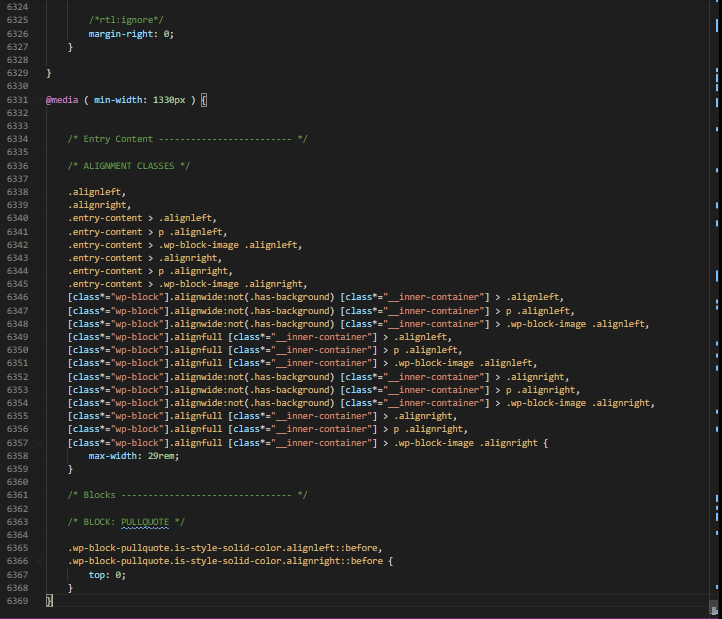
Here’s a screenshot from the CSS file for this website to illustrate.

There are over 6000 lines of CSS on this webpage!

But isn’t it worth it? Especially after that nightmare, you encountered above.

It’s worth it.

So, if you want to understand why your website looks the way it does, and if you want to learn how to make it look the way you want, then you’ll need to understand how to read CSS.

CSS syntax

CSS consists of rule-sets that provide instructions to the browser about how to style an element.

This is a rule set for a paragraph element:

p {
color: red;
text-align: center;
}

Rule-sets contain four parts:

  1. a selector 
  2. a declaration block 
  3. the property 
  4. the value

Here’s how this applies to the example above.

  • the selector: p
  • the declaration block: everything contained within { }
  • the property: color:/ text-align:
  • the value of the property: red;/center;

The p in this rule-set tells the browser that every HTML p element should have the colour of red and should have center alignment.

In other words, the selector references the element you’d like to style. The declaration block contains the styles you’d like to apply to the element. And the property/values provide the specific styles to use.

Like HTML, CSS has specific syntactic rules that must be followed. When this syntax is followed a browser can correctly determine which element to apply the style to and what the properties and values of this style are.

For example:

This is a rule-set:

p {
color: red;
}

This is not a rule-set: 

p {
color: red;

This is not a rule-set:

p color: red;
}

This is not a rule-set:

{ p
color: red;
 }

CSS Rules

Case Sensitivity

CSS is and is not case-sensitive.

When you are writing which element you’d like to select you can use either uppercase or lowercase. But you should always use lowercase.

Example:

Do this:

p {
color: red;
}

Not this:

P {
color: red;
}

Even though uppercase and lowercase are interchangeable, you should always use lowercase.

The only time when case matters is when you are selecting an element with an id or class that has a name that uses uppercase and lowercase.

For example, if you wanted to style the HTML elements below.

<p id= "customElementByID">My element ID</p>
<p class= "customElementByClass">My element class</p>

And you wanted to select the elements by their class instead of their tag type, then case sensitivity matters.

By ID do this:

#customElementByID {
color: red;
}

Not this:

#customelementbyid {
color: red;
}

By Class do this:

.customElementByClass {
color: red;
}

Not this:

.customelementbyclass {
color: red;
}

CSS can have many properties and values within the declaration block. Every property value should be written on its own line and end with a semicolon

Do this:

p {
color: red;
size: 20px;
}

Not this:

p {
color: red; size: 20px
}

You can apply the same style to many selectors

For example:

h1, h2, h3, h4, h5 {
size: 200px;
}

CSS cascades

One of the most important rules of CSS is that it cascades.

If you have multiple styles targeting the same element, the style that is closest or most specific to the element will apply.

For example, if I select the same p element twice, once with the p tag selector and once with the id tag selector, the style using the id tag will be used.

Here’s what that would look like. Imagine this is the element I’m trying to style:

<p id="introParagraph">This is my intro paragraph</p>

Imagine I wrote the two CSS rule-sets below:

p {
color: red;
}
#introParagraph {
color: blue;
} 

The second rule-set, with the #introParagraph id selector will be applied and it will overwrite the color: red of the p and replaces it with color:blue.

Cascading may be a bit confusing but don’t get caught up on this for now as I’ll cover it in greater detail in another blog post. Just keep in mind that the closer in proximity a CSS rule-set is to the element it’s trying to style, the more likely it will be applied.

There are many CSS property value combinations, each with varied nuances about how they act and display on the page. w3schools schools have a handy CSS reference available, I recommend taking a moment to read up on the various types.

Ok, I hope this post will help you understand how to read CSS and that you now have a better grasp of CSS syntax, semantics, and best practices.

Next up, I suggest you start moving on to the most exciting aspect of front-end web development: JavaScript.

Here’s my guide to JavaScript basics: syntax, semantics, and best practices.

Categories
CSS HTML JavaScript

How a web browser builds a website

If you want to learn how to build websites, program in JavaScript, become a front end web developer or are just genuinely curious about how websites work  —  you need to understand how a web browser (browser) builds a website.

This post will help you do just that.

Have you ever read something online? I’m willing to bet you have. Was it a news article or a long-form travel story? A Wikipedia article or maybe a serialized choose your own adventure Harry Potter fan fiction? Perhaps it was this very blog post?

Regardless, do you remember when it was written and what it was about? Do you remember how it looked and who wrote it? Or, better yet, can you tell me what wrote it?

That’s right, what.

Not sure? Here’s a hint: when you look at a blog post, news article, or any written content on your browser you are looking at the end result of a set of precisely followed instructions. These instructions tell your browser how to build, present and interact with the content on your screen. So, in answer to the question, your browser is the what. The who, I’ll leave to you.

The how? The precisely followed instructions!

These instructions come in three flavours: HTML, CSS and JavaScript, each of which contains directions that your browser follows to build a webpage. Coincidentally, someone who specializes in the three aforementioned technologies is called a front end developer or a web developer (I guess I didn’t leave the who to you after all).

Let’s take this one step further by using an analogy.

Imagine for a moment that your browser is a construction worker who needs to build a house. The house, in this case, is a website, and HTML, CSS and JavaScript are the blueprints for different parts of the house: the architecture, the style and the interactivity.

HTML (hypertext markup language)

This is the architecture of your house — it tells your browser how to organize the content on the page and what that content is.

It also tells your browser where it can find the other resources necessary to finish building the page, specifically the location of the CSS and JavaScript files. 

HTML is the first thing a browser reads when building a website and while it has has a specific initial structure, this structure can be expanded, reduced or transformed by CSS and JavaScript, in the same way you can add rooms, remove them or transform them on a blueprint. A kitchen can become a living room after all — especially on a blueprint.

HTML tells your browser the semantic meaning of the content on your website. This is similar to a legend on a map. Without this legend, your browser would not be able to distinguish the difference between content types on your web page (paragraphs, lists, titles, etc.). Consequentially, without this legend, your brows would not be able to correctly assign the styles and behaviours that distinguish one content type from another. You don’t want your lists displaying as paragraphs, do you?

In other words, HTML provides a reference so the browser can understand what the content is:

That content is a paragraph.

  • This content over here?
  • It’s different from the paragraph!
  • It’s a list!

HTML provides the distin level of detail so your browser can distinguish the content types.

For these reasons, I like to think of HTML as the architectural blueprint of your house.

CSS (Cascading Style Sheets)

This is the style of your house  —  from the carpet to the curtains, wallpaper to shingles, CSS is responsible for telling the browser how your web page should look and, if you desire, how it should transform.

CSS builds upon the architecture which HTML provides and references it to know which items it needs to apply styles to. Things like colours, spacing, animation and layout are controlled by CSS — without it, your webpage is boring.

Progressively, after the HTML is loaded, your browser then consults with CSS to understand how it should style all of the architecture laid out by HTML. Specifically, your browser references CSS to determine what the content defined in HTML should look like.

Everything from how the page should look on a phone, tablet or laptop to the colour of text, the spacing between lines and, as mentioned, the animation is provided by CSS.

For these reasons, I like to think of CSS as the style blueprint for your house.

JavaScript

This is the interactivity of your house — from when the lights should turn on to when the thermostat should lower, what time your alarm clock goes off to what temperature your oven should pre-heat to.

If it’s something that you can interact with, it’s probably governed by JavaScript.

Like CSS, JavaScript builds upon the architecture that HTML provides, and after the architecture of your house is built and styled, JavaScript goes to work defining what can be interacted with and how.

JavaScript governs interactions through event triggers and outputs:

An event trigger is something that needs to happen before an output can take place. JavaScript can tell your browser to listen for a specific event trigger (perhaps a click or a scroll), and when this trigger takes place, to perform a specific action.

An output is the action that happens after the trigger is activated. For example, let’s say someone pressed the doorbell at your house (event trigger) the output would be the specific sound that plays. Another example: you turn your stove on. The temperature which it rises to before turning off is the output.

Like cause and effect — the web browser equivalent is JavaScript — and through event triggers and outputs, JavaScript brings interactivity to your page. And interactivity is an absolutely essential component of modern websites

For these reasons, I like to think of JavaScript as the blueprint for the interactivity of your house.

Wrapping it all up: HTML, CSS and JavaScript

  • HTML is the architecture
  • CSS is the style
  • JavaScript interactivity
  • Each of these technologies makes up the front end of your website and each is essential to what most users expect from a modern website.
  • Your web browser follows the blueprints laid out in HTML, CSS and JavaScript to determine how to build a webpage, how this webpage should look and how you’ll be allowed to interact with it.
  • Someone who specializes in these technologies is called a web developer or front end developer.

So, hopefully after reading this post you now feel more familiar with how your browser constructs a web page.

Next, it’s time to learn about HTML, the most important part of a website.