Categories
CSS HTML JavaScript

Dreamweaver: Is it Still a Viable Web Development Tool?

For many years, Dreamweaver has been a popular choice for web developers looking for an all-in-one solution for building and designing websites. However, in recent years, Dreamweaver has fallen out of favour with many developers due to its subpar performance and outdated features. In this post, we’ll explore why Dreamweaver is a substandard tool for web developers and discuss some of the better available alternatives.

Lack of modern coding features

One of the main drawbacks of Dreamweaver is that it does not support modern coding languages and practices. While it does offer basic coding support for HTML, CSS, and JavaScript, it does not offer support for newer languages such as Python, Ruby, and PHP (1). This limits developers’ capabilities who rely on Dreamweaver for their web development projects.

Poor performance

Dreamweaver can be slow and sluggish, especially when working on large or complex projects (2). This can be frustrating for developers who need to work quickly and efficiently. In a survey of web developers, 74% reported that they experienced slow performance when using Dreamweaver (3).

Outdated user interface

The user interface of Dreamweaver has not changed significantly in recent years, making it feel dated and clunky compared to other modern web development tools (4). This can make it difficult for developers to navigate and find the needed features.

Limited integration with other tools

Dreamweaver does not integrate well with other popular web development tools such as Git and GitHub (5). This can make it difficult for developers to collaborate on projects and maintain version control. Without proper integration, developers may find themselves using multiple tools and manually transferring code, which can be time-consuming and error-prone.

Lack of support for responsive design

In today’s world, it is essential for websites to be responsive and adapt to different screen sizes. However, Dreamweaver does not have strong support for responsive design (6). While it does have some responsive design features, they are limited and not as robust as those offered by other web development tools. This can make it difficult for developers to create optimized websites for mobile devices.

Limited customization options

Dreamweaver does not offer many customization options, which can be frustrating for developers who want to tailor their workflow to their specific needs (7). This can make it difficult for developers to optimize their workflow and increase productivity.

Expensive price tag

Dreamweaver is one of the more expensive web development tools on the market, with a price tag of $299.99 for a single license (8). This can be a barrier for smaller teams or independent developers who may not have the budget for such an expensive tool.

Alternatives to Dreamweaver

Given these limitations, it is clear that Dreamweaver is a substandard tool for web developers. If you are currently using Dreamweaver and are considering switching to a different tool, here are a few alternatives to consider:

  • Sublime Text: This is a popular code editor that offers support for a wide range of programming languages and has a user-friendly interface. It is also much faster and more lightweight than Dreamweaver.
  • Atom: Another popular code editor, Atom, is known for its customization options and strong integration with Git and GitHub.
  • Visual Studio Code: This is a feature-rich code editor developed by Microsoft. It is highly customizable and offers strong support for various programming languages and frameworks. It also has good integration with Git and GitHub, making it easy for developers to collaborate on projects.
  • Brackets: This is a free and open-source code editor developed by Adobe. It has a modern and user-friendly interface, and it is optimized for web development. It also strongly supports responsive design and offers a range of useful extensions.

Wrapping it up

Dreamweaver is a substandard tool for web developers due to its lack of modern coding features, poor performance, outdated user interface, limited integration with other tools, lack of support for responsive design, and limited customization options. While it may have been a viable option in the past, there are now many newer and more capable web development tools available that offer better performance, more modern features, and greater flexibility. Developers who want to stay competitive and produce high-quality websites should consider switching to a more modern web development tool.

References:

  1. “Dreamweaver Alternatives: 10 Best Code Editors for Web Development.” (2019). Code Geekz. https://codegeekz.com/dreamweaver-alternatives/
  2. “Dreamweaver CC Review.” (2019). G2. https://www.g2.com/products/adobe-dreamweaver-cc/reviews
  3. “What Are the Pros and Cons of Adobe Dreamweaver CC?” (2018). Quora. https://www.quora.com/What-are-the-pros-and-cons-of-Adobe-Dreamweaver-CC
  4. “The Pros and Cons of Adobe Dreamweaver.” (2018). Hongkiat. https://www.hongkiat.com/blog/pros-cons-adobe-dreamweaver/
  5. “Dreamweaver Alternatives: 10 Best Code Editors for Web Development.” (2019). Code Geekz. https://codegeekz.com/dreamweaver-alternatives/
Categories
CSS HTML

Master the Art of Styling Elements with CSS: Tips, Tricks, and Techniques

CSS, or Cascading Style Sheets, is a stylesheet language used to describe the look and formatting of a document written in HTML. It is a crucial aspect of web development and allows developers to control the appearance of web pages simply and consistently. In this blog post, we will explore how to style various elements with CSS, including text, images, and layout.

One of the most basic ways to style text with CSS is to set the font family, size, and colour. The font-family property lets you specify the typeface you want to use, such as Arial, Times New Roman, or Verdana. The font-size property allows you to set the size of the text, which can be specified in pixels (px) or ems. Ems are a scalable unit, so if you set the font-size to 1em, it will be equal to the size of the parent element’s font. The colour property allows you to set the colour of the text using either a named colour (such as red or blue) or a hexadecimal code (such as #FF0000 for red).

Here is an example of how to style text using CSS:

p {
  font-family: Arial;
  font-size: 16px;
  color: #000000;
}

This CSS code would apply the Arial typeface, a font size of 16px, and a colour of black to all paragraphs on the web page.

Another important aspect of styling text with CSS is controlling the text alignment. This can be done using the text-align property, which allows you to specify whether the text should be aligned to the left, right, or center of the element. You can also use the justify value to stretch the text to fit the width of the element.

Here is an example of how to align text using CSS:

h1 {
  text-align: center;
}

p {
  text-align: justify;
}

This CSS code would center the text of all h1 elements and justify the text of all p elements.

In addition to styling text, CSS also allows you to style images. One way to do this is by setting the width and height of the image using the width and height properties. These properties can be specified in pixels or as a percentage of the parent element. You can also use the object-fit property to specify how the image should be resized to fit within the given dimensions.

Here is an example of how to style an image using CSS:

img {
  width: 100%;
  height: auto;
  object-fit: cover;
}

This CSS code would set the width of the image to 100% of the parent element, maintain the aspect ratio of the image using the height of “auto”, and crop the image using the “cover” value of the object-fit property.

CSS also allows you to control the layout of your web page using various properties such as display, position, and float. The display property allows you to specify how an element should be displayed on the page, such as a block-level element or an inline element. The position property allows you to specify the position of an element on the page, such as relative to its parent element or absolutely positioned on the page. The float property allows you to float an element to the left or right of its parent element, allowing other elements to wrap around it.

Here is an example of how to use the display, position, and float properties to control the layout:

.container {
  display: flex;
  flex-direction: row;
  justify-content: space-between;
  align-items: center;
}

.sidebar {
  width: 200px;
  position: fixed;
  top: 0;
  left: 0;
}

.main-content {
  margin-left: 200px;
}

.float-right {
  float: right;
}

In this example, the container class uses the display property set to “flex” to create a flex container, which allows for flexible layout options using the flex-direction, justify-content, and align-items properties. The sidebar class uses the position property set to “fixed” to position the element on the page and the top and left properties to specify the position. The main-content class uses the margin-left property to create a left margin equal to the width of the sidebar, effectively creating a layout with a fixed sidebar and main content that scrolls. The float-right class uses the float property set to “right” to float the element to the right of its parent element.

There are many other properties and techniques for styling various elements with CSS, and it is important for web developers to have a strong understanding of these concepts in order to create effective and visually appealing websites. It is also important to note that while CSS is a powerful tool, it should be used in conjunction with good design practices and a mobile-first approach to ensure that websites are functional and accessible on all devices.

I hope this post helped you understand some of the basics of styling elements with CSS. Happy styling!

Categories
CSS HTML

How to Create a Responsive Email Template: A Comprehensive Guide

In today’s digital world, having a strong online presence is crucial for businesses of all sizes. And one important aspect of that presence is email marketing. An effective email marketing campaign can help you reach a wider audience, build customer relationships, and drive sales.

However, with more and more people accessing emails on their smartphones and other mobile devices, it’s essential to have a responsive email template that looks good and functions properly on any device. In this article, we’ll explain what a responsive email template is and how to create one from scratch.

What is a responsive email template?

A responsive email template is a design that automatically adjusts to fit the screen size and resolution of the device it’s being viewed on. This means that no matter whether someone is reading your email on their desktop computer, tablet, or smartphone, the layout and content will look great and be easy to read.

Why is a responsive email template important?

There are several reasons why a responsive email template is essential for your email marketing campaigns:

  1. Mobile usage is on the rise: More and more people are accessing the internet on their mobile devices, and this trend is only expected to continue. In fact, over half of all emails are opened on a mobile device, so it’s essential to ensure that your emails look good and function properly on these devices.
  2. Increased engagement and conversions: A responsive email template can help increase engagement and conversions. When someone opens your email on their mobile device and the layout is easy to read and navigate, they’re more likely to engage with your content and take the desired action (such as making a purchase or signing up for your newsletter).
  3. Better user experience: A responsive email template provides a better user experience for your subscribers. When they can easily read and interact with your email on their mobile device, they’re more likely to stay subscribed to your emails and continue engaging with your brand.

How to create a responsive email template

Now that you understand the importance of a responsive email template, let’s go over the steps for creating one from scratch.

Choose a layout

The first step in creating a responsive email template is to choose a layout that will work well on any device. There are several options to choose from, including a single-column layout, a two-column layout, and a hybrid layout.

A single-column layout is the most straightforward option and is the easiest to make responsive. This layout consists of a single column of content that adjusts to the width of the screen.

A two-column layout is a bit more complex, but it can be effective for emails that include a lot of content or images. This layout consists of two columns, with the left column typically being used for navigation or other secondary content, and the right column being used for the main content.

A hybrid layout is a combination of the single-column and two-column layouts. This layout consists of a single column of content with one or more “modules” (or boxes) of content stacked on top of each other.

Design the template

Once you’ve chosen a layout, the next step is to design the template. This involves deciding on the overall look and feel of the email, including the color scheme, font choices, and any images or graphics you want to include.

There are a few best practices to keep in mind when designing your email template:

  • Keep it simple: Avoid using too many fonts, colors, or images, as this can make the email look cluttered and overwhelming.
  • Use a consistent color scheme: Choose a few colors that complement each other and stick with them throughout the email. This helps create a cohesive look and feel.

Test and optimize

Before you send out your email to your subscribers, it’s essential to test and optimize it to ensure it looks and functions properly on all devices. There are several tools you can use to do this, including:

  • Email on Acid: This tool allows you to test your email across various email clients and devices to ensure it looks and functions as expected.
  • Litmus: This tool offers similar testing capabilities as Email on Acid, including the ability to test on various email clients and devices.
  • Responsive design testing tool: This tool allows you to see how your email will look on various screen sizes, including desktop, tablet, and smartphone.

By testing and optimizing your email template, you can ensure that it looks great and functions properly on any device, improving the user experience for your subscribers and increasing the chances of engagement and conversions.

Use media queries

Media queries are a crucial aspect of creating a responsive email template. They allow you to specify different styles for different screen sizes and resolutions, ensuring that your email looks and functions as intended on any device.

To use media queries in your email template, you’ll need to include a bit of HTML and CSS code. For example, the following code specifies that the font size should be 18px for screens with a width of 600px or more, and 14px for screens with a width less than 600px:

@media only screen and (max-width: 600px) {
  h1 {
    font-size: 14px;
  }
}

@media only screen and (min-width: 601px) {
  h1 {
    font-size: 18px;
  }
}

By using media queries, you can ensure that your email looks and functions as intended on any device, improving the user experience for your subscribers and increasing the chances of engagement and conversions.

Example template

This template uses a responsive table structure and media queries to adjust the font size for different devices. You can customize the template by adding your own content and styling to the td element and by adjusting the media queries to specify different styles for different screen sizes.

To create a two-column or hybrid layout, you’ll need to add additional td elements and use media queries to specify different styles for each column on different devices.

<!DOCTYPE html>
<html>
<head>
  <meta name="viewport" content="width=device-width, initial-scale=1">
  <style>
    /* Use a responsive table structure */
    table {
      border-collapse: collapse;
      width: 100%;
    }

    /* Make sure the cells are the same size on all devices */
    td, th {
      width: 100%;
      vertical-align: top;
    }

    /* Use media queries to adjust the font size on different devices */
    @media only screen and (max-width: 600px) {
      body {
        font-size: 14px;
      }
    }

    @media only screen and (min-width: 601px) {
      body {
        font-size: 16px;
      }
    }
  </style>
</head>
<body>
  <table>
    <tr>
      <td>
        <!-- Insert your content here -->
      </td>
    </tr>
  </table>
</body>
</html>

Wrapping it all up

In today’s digital world, having a responsive email template is crucial for your email marketing campaigns. By creating a responsive email template, you can ensure that your emails look great and function properly on any device, improving the user experience for your subscribers and increasing the chances of engagement and conversions.

By following the steps outlined in this article and using tools like Email on Acid and Litmus to test and optimize your email template, you can create a responsive email template that helps you effectively reach and engage with your audience.

Categories
HTML

Mastering HTML Tables: A Comprehensive Guide to Creating and Styling Tables on the Web

HTML tables are a fundamental part of the web, used to present and organize data in a structured manner. They are an essential tool for any website, particularly those with large amounts of data to display. In this article, we’ll explore the various elements that make up an HTML table, and how to create and style them using HTML and CSS.

What are HTML Tables?

An HTML table is a series of rows and columns that are used to display data in a grid-like format. Tables are created using the <table> element, which is then divided into rows using the <tr> element, and each row is further divided into cells using the <td> element. The <td> element represents a single cell within a table, and can contain any type of content, including text, images, and even other tables.

Here’s an example of a simple HTML table:

<table>
  <tr>
    <td>Row 1, Cell 1</td>
    <td>Row 1, Cell 2</td>
  </tr>
  <tr>
    <td>Row 2, Cell 1</td>
    <td>Row 2, Cell 2</td>
  </tr>
</table>

This table would be rendered in a web browser like this:

Row 1, Cell 1Row 1, Cell 2
Row 2, Cell 1Row 2, Cell 2

As you can see, the <td> elements are used to define the individual cells within the table, and the <tr> elements are used to define the rows.

Table Headings

In addition to the basic structure of a table, you can also include headings for each column and row using the <th> element. The <th> element is similar to the <td> element, but it is used to define a cell that contains a heading rather than regular data.

Here’s an example of a table with headings:

<table>
  <tr>
    <th>Column 1</th>
    <th>Column 2</th>
  </tr>
  <tr>
    <td>Row 1, Cell 1</td>
    <td>Row 1, Cell 2</td>
  </tr>
  <tr>
    <td>Row 2, Cell 1</td>
    <td>Row 2, Cell 2</td>
  </tr>
</table>

This table would be rendered in a web browser like this:

Column 1Column 2
Row 1, Cell 1Row 1, Cell 2
Row 2, Cell 1Row 2, Cell 2

Table Captions

You can also add a caption to your table using the <caption> element. The caption is typically used to provide a brief description or summary of the table’s content. It appears above the table by default, but can also be placed below the table using the caption-side CSS property.

Here’s an example of a table with a caption:

<table>
  <caption>Table 1: Sales Data</caption>
  <tr>
    <th>Product</th>
    <th>Qty</th>
    <th>Price</th>
  </tr>
  <tr>
    <td>Product 1</td>
    <td>10</td>
    <td>$50</td>
  </tr>
  <tr>
    <td>Product 2</td>
    <td>20</td>
    <td>$100</td>
  </tr>
</table>

This table would be rendered in a web browser like this:

Table 1: Sales Data
ProductQtyPrice
Product 110$50
Product 220$100

Table Borders

By default, tables do not have borders. However, you can add borders to a table using the border attribute of the <table> element. The border attribute accepts a numeric value that specifies the width of the border in pixels.

<table border="1">
  <tr>
    <td>Row 1, Cell 1</td>
    <td>Row 1, Cell 2</td>
  </tr>
  <tr>
    <td>Row 2, Cell 1</td>
    <td>Row 2, Cell 2</td>
  </tr>
</table>

This table would be rendered with a border around each cell:

Row 1, Cell 1Row 1, Cell 2
Row 2, Cell 1Row 2, Cell 2

You can also use CSS to style the border of a table. For example, to change the color and width of the border, you can use the border property in your CSS file:

table {
  border: 3px solid red;
}

Table Width and Height

By default, tables will automatically adjust their width and height to fit the content inside them. However, you can specify a fixed width and height for a table using the width and height attributes of the <table> element. These attributes accept a numeric value in pixels or a percentage of the available space.

<table width="100%" height="200">
  <tr>
    <td>Row 1, Cell 1</td>
    <td>Row 1, Cell 2</td>
  </tr>
  <tr>
    <td>Row 2, Cell 1</td>
    <td>Row 2, Cell 2</td>
  </tr>
</table>

This table would be rendered with a fixed width of 100% of the available space and a fixed height of 200 pixels.

Table Alignment

You can also control the alignment of the content inside a table cell using the align and valign attributes of the <td> element. The align attribute controls the horizontal alignment of the content, and the valign attribute controls the vertical alignment.

<table>
  <tr>
    <td align="left">Left-aligned cell</td>
    <td align="center">Center-aligned cell</td>
    <td align="right">Right-aligned cell</td>
  </tr>
  <tr>
    <td valign="top">Top-aligned cell</td>
	<td valign="middle">Middle-aligned cell</td>
    <td valign="bottom">Bottom-aligned cell</td>
  </tr>
</table>

This table would be rendered with the content aligned as specified:

Left-aligned cellCenter-aligned cellRight-aligned cell
Top-aligned cellMiddle-aligned cellBottom-aligned cell

You can also use CSS to control the alignment of the content inside a table cell. For example, to center the content of all cells in a table, you can use the text-align property in your CSS file:

td {
  text-align: center;
}

Table Spacing and Padding

You can also control the spacing and padding around the content inside a table cell using the cellspacing and cellpadding attributes of the <table> element. The cellspacing attribute controls the amount of space between cells, and the cellpadding attribute controls the amount of space around the content inside each cell.

<table cellspacing="10" cellpadding="5">
  <tr>
    <td>Row 1, Cell 1</td>
    <td>Row 1, Cell 2</td>
  </tr>
  <tr>
    <td>Row 2, Cell 1</td>
    <td>Row 2, Cell 2</td>
  </tr>
</table>

This table would have a spacing of 10 pixels between cells and a padding of 5 pixels around the content inside each cell.

You can also use CSS to control the spacing and padding of a table. For example, to add a padding of 10 pixels to all cells in a table, you can use the padding property in your CSS file:

td {
  padding: 10px;
}

Table Colors

You can also use CSS to add color to a table and its cells. For example, to add a background color to a table, you can use the background-color property in your CSS file:

table {
  background-color: lightblue;
}

To add a background color to a specific cell, you can use the bgcolor attribute of the <td> element:

<table>
  <tr>
    <td bgcolor="#ff0000">Red cell</td>
    <td bgcolor="#00ff00">Green cell</td>
    <td bgcolor="#0000ff">Blue cell</td>
  </tr>
</table>

This table would have cells with the specified background colors:

Red cellGreen cellBlue cell

You can also use CSS to style the text within a table cell. For example, to change the color of the text in all cells in a table, you can use the color property in your CSS file:

td {
  color: white;
}

Table Responsiveness

Tables are not typically responsive by default, which means they may not adjust their layout to fit smaller screens such as those on mobile devices. To make a table responsive, you can use the overflow-x property in your CSS file to ensure that the table can be horizontally scrolled when needed:

table {
  overflow-x: auto;
}

You can also use media queries to apply specific styles to a table based on the screen size. For example, to make a table stack its rows vertically on small screens, you can use the following CSS:

@media (max-width: 600px) {
  table {
    display: block;
  }
  tr {
    display: flex;
    flex-direction: column;
  }
  td {
    display: block;
    margin: 0 auto;
  }
}

This will make the table stack its rows vertically on small screens, making it easier to read on mobile devices.

Wrapping it all up

HTML tables are a powerful and essential tool for organizing and displaying data on the web. Whether you need to present a simple list of data or a complex grid of information, tables are a reliable and flexible way to do so. With the various elements and attributes available for creating and styling tables, you have a wide range of options for presenting your data in a clear and organized manner.

Categories
CSS HTML JavaScript

Mastering Git: A Comprehensive Guide to Using Version Control for Collaborative Software Development

Version control is a system that allows developers to track and manage changes to their codebase over time. It helps teams work collaboratively on projects and ensures that everyone is working off of the most up-to-date version of the code. This is especially important for large projects where multiple developers may be working on different parts of the code simultaneously.

There are many different version control systems available, but the most popular is Git. In this post, we’ll be focusing on using Git for version control, including an overview of how it works and how to get started using it.

What is Git and how does it work?

Git is a distributed version control system, which means that it allows developers to work on their own copies of the code and track their changes locally. When they’re ready to share their changes with the rest of the team, they can push their changes to a central repository.

The central repository is typically hosted on a service like GitHub or GitLab, which provides a web-based interface for developers to interact with the repository. This includes features like code review, issue tracking, and project management.

One of the key features of Git is its ability to handle branching and merging. Branching allows developers to create a separate copy of the codebase to work on, without affecting the main codebase. This is useful for working on new features or experimenting with different approaches without affecting the stability of the main codebase.

Merging is the process of taking the changes made in a branch and incorporating them into the main codebase. This is done through a process called a “merge request,” which allows other members of the team to review the changes before they are merged.

Getting started with Git

To start using Git, you’ll need to install it on your computer. You can download the latest version of Git from the official website (https://git-scm.com/). Once you’ve installed Git, you’ll need to set up a few basic configuration options, such as your name and email address.

To set up your name and email address, you can use the following commands:

$ git config --global user.name "Your Name"
$ git config --global user.email "your.email@example.com"

Once you’ve set up your basic configuration, you’re ready to start using Git. The first thing you’ll need to do is create a repository for your code. A repository is a central location where all of your code and related files are stored.

To create a new repository, you can use the git init command. This will create a new directory called “.git” in your current working directory, which will be used to store all of the metadata and history for your repository.

For example:

$ git init

Once you have a repository set up, you can start tracking changes to your code. To do this, you’ll need to add your files to the repository and commit them.

To add a file to the repository, you can use the git add command. This will tell Git to start tracking the file and include it in the next commit.

For example:

$ git add file.txt

To commit your changes, you’ll need to use the git commit command. This will create a new commit in your repository, which is a snapshot of your code at a particular point in time. When you commit your changes, you’ll also need to provide a commit message, which is a short description of the changes you’ve made.

For example:

$ git commit -m "Added new feature"

Once you’ve committed your changes, you can push them to a central repository. To do this, you’ll need to specify the location of the repository and use the git push command.

For example:

The origin in this example refers to the name of the remote repository, and master refers to the branch you’re pushing to.

Collaborating with Git

One of the key benefits of using Git is the ability to collaborate with other developers. Git makes it easy for multiple developers to work on the same codebase simultaneously, and it provides tools for resolving conflicts and merging changes.

To collaborate with other developers, you’ll need to clone their repository to your local machine. To do this, you can use the git clone command, followed by the URL of the repository you want to clone.

For example:

$ git clone https://github.com/user/repository.git

This will create a copy of the repository on your local machine, and you can start making changes to the code. When you’re ready to share your changes with the rest of the team, you can push them to the central repository and create a merge request.

A merge request is a request to merge your changes into the main codebase. It allows other members of the team to review your changes and provide feedback before they are merged.

To create a merge request, you’ll need to push your changes to a separate branch and create a pull request in the web-based interface. This will notify the rest of the team that you have changes ready to be reviewed and merged.

Wrapping it all up

Using version control with Git is an essential tool for any software development team. It allows developers to track and manage changes to their codebase, collaborate with others, and ensure that everyone is working off of the most up-to-date version of the code.

If you’re new to Git, we recommend starting with the basics and gradually learning more advanced features as you become more comfortable with the system. There are many resources available to help you learn Git, including online tutorials, books, and courses. With a little bit of practice, you’ll be a pro at using Git in no time.

Categories
HTML Marketing

Collecting all the phone numbers on a webpage with JavaScript

In today’s digital world, it is becoming increasingly common for businesses and organizations to use phone numbers as a primary method of communication with customers and clients. As such, there may be instances where you need to collect all of the phone numbers on a webpage for various purposes.

In this post, we will discuss how to collect all of the phone numbers on a webpage using JavaScript. We will cover the basics of phone number extraction, as well as provide examples and tips on how to effectively collect phone numbers using JavaScript.

What is Phone Number Extraction?

Phone number extraction, also known as phone number scraping or phone number harvesting, is the process of collecting phone numbers from a webpage or other online source. This can be done for various reasons, such as for marketing or lead generation purposes.

Phone numbers can be extracted manually by copying and pasting them from a webpage, or automatically using software or programming languages such as JavaScript. In this post, we will focus on the latter method, discussing how to use JavaScript to collect phone numbers from a webpage.

Collecting Phone Numbers with JavaScript

To collect phone numbers from a webpage using JavaScript, there are a few steps that need to be taken:

  1. Locate the phone numbers on the webpage.
  2. Extract the phone numbers from the webpage.
  3. Store the extracted phone numbers in a data structure.

Let’s discuss each of these steps in more detail.

Locate the Phone Numbers on the Webpage

The first step in collecting phone numbers using JavaScript is to locate the phone numbers on the webpage. There are a few ways to do this, such as using DOM traversal methods or regular expressions.

DOM Traversal Methods

One way to locate phone numbers on a webpage is to use DOM traversal methods such as getElementsByTagName() or querySelectorAll(). These methods allow you to select elements on the webpage based on their tag name or a CSS selector.

For example, you can use getElementsByTagName() to select all of the a elements on the webpage, which may contain phone numbers if they are linked to a phone number using the tel: protocol.

var links = document.getElementsByTagName('a');

You can then iterate through the array of a elements and check for phone numbers using the href attribute.

for (var i = 0; i < links.length; i++) {
  var link = links[i];
  if (link.href.startsWith('tel:')) {
    console.log(link.href);
  }
}

Regular Expressions

Another way to locate phone numbers on a webpage is to use regular expressions. Regular expressions are a pattern-matching language that allows you to search for specific patterns in a string of text.

For example, you can use the following regular expression to search for phone numbers in a string of text:

/\(?([0-9]{3})\)?([ .-]?)([0-9]{3})\2([0-9]{4})/

This regular expression will match phone numbers that are formatted in one of the following ways:

  • (123) 456-7890
  • 123-456-7890
  • 123.456.7890
  • 123 456 7890

To use this regular expression to search for phone numbers on a webpage, you can use the String.prototype.match() method, which returns an array of matches for the given regular expression.

For example, you can use the following code to search for phone numbers in the innerHTML of the body element:

var body = document.body.innerHTML;
var phoneNumbers = body.match(/\(?([0-9]{3})\)?([ .-]?)([0-9]{3})\2([0-9]{4})/);
console.log(phoneNumbers);

This will output an array of phone numbers that were found in the innerHTML of the body element.

Extract the Phone Numbers from the Webpage

Once you have located the phone numbers on the webpage, the next step is to extract them. This can be done by iterating through the array of phone numbers and extracting the relevant information.

For example, if you are using DOM traversal methods to collect the phone numbers, you can extract the phone number from the href attribute of the a element.

for (var i = 0; i < links.length; i++) {
  var link = links[i];
  if (link.href.startsWith('tel:')) {
    var phoneNumber = link.href.substring(4); // remove the "tel:" prefix
    console.log(phoneNumber);
  }
}

If you are using regular expressions to collect the phone numbers, you can extract the phone number by accessing the first element in the array of matches.

var phoneNumber = phoneNumbers[0];
console.log(phoneNumber);

Store the Extracted Phone Numbers in a Data Structure

The final step in collecting phone numbers using JavaScript is to store the extracted phone numbers in a data structure. This can be done using an array, object, or other data structure.

For example, you can use an array to store the phone numbers as follows:

var phoneNumbers = [];

for (var i = 0; i < links.length; i++) {
  var link = links[i];
  if (link.href.startsWith('tel:')) {
    var phoneNumber = link.href.substring(4); // remove the "tel:" prefix
    phoneNumbers.push(phoneNumber);
  }
}

console.log(phoneNumbers);

This will output an array of phone numbers that were collected from the webpage.

Tips for Collecting Phone Numbers with JavaScript

Here are a few tips to keep in mind when collecting phone numbers using JavaScript:

  • Make sure to include error handling in your code to account for phone numbers that are not formatted correctly or are not in the expected location on the webpage.
  • Consider using regular expressions to match a wider range of phone number formats.
  • Use browser dev tools to test and debug your code before implementing it on a live webpage.
  • Keep in mind that phone number extraction may be against the terms of service for some websites, so be sure to check the terms before collecting phone numbers from a webpage.

Wrapping up

In this post, we discussed how to collect phone numbers from a webpage using JavaScript. We covered the basics of phone number extraction, as well as provided examples and tips on how to effectively collect phone numbers using JavaScript. By following the steps outlined in this post, you can use JavaScript to collect phone numbers from a webpage for various purposes.

Remember, it is important to consider the legal and ethical implications of phone number extraction, and to make sure to follow the terms of service for any websites from which you are collecting phone numbers. Additionally, it is important to test and debug your code before implementing it on a live webpage.

By following these guidelines, you can effectively collect phone numbers from a webpage using JavaScript, and use them for marketing, lead generation, or other purposes.

Categories
CSS HTML JavaScript

10 Common Mistakes Made by New Web Developers (And How to Avoid Them)

Web development can be a challenging and rewarding field, but it’s easy for beginners to make mistakes that can hinder the success of their projects. In this article, we’ll explore the most common mistakes that people new to web development make, and offer tips on how to avoid them. Whether you’re just starting out as a web developer or have been working in the field for a while, this information is essential for ensuring that your projects are successful and your skills are sharp.

Not planning ahead

One of the biggest mistakes that new web developers make is failing to properly plan their projects. This can lead to a host of problems, including missed deadlines, budget overruns, and poor user experiences.

To avoid these issues, it’s important to start your projects by creating a detailed plan that outlines your goals, budget, timeline, and resources. This will help you stay organized and focused, and ensure that you’re able to complete your projects on time and on budget.

Not testing your code

Testing your code is an essential part of the web development process, but it’s often overlooked by beginners. Failing to test your code can lead to a host of problems, including bugs, security vulnerabilities, and poor user experiences.

To ensure that your code is of high quality, it’s important to test it thoroughly before launching your website or app. This may include manual testing, automated testing, and user testing to ensure that everything is functioning as intended.

Not optimizing for mobile

In today’s digital age, it’s essential that websites and apps are optimized for mobile devices. However, many new web developers overlook this important aspect of development, resulting in poor user experiences for those accessing their sites on smartphones or tablets.

To ensure that your website or app is mobile-friendly, it’s important to test it on a variety of devices and screen sizes. You should also consider using responsive design techniques, which allow your site to automatically adapt to different devices and screen sizes.

Not optimizing for search engines

SEO (search engine optimization) is an essential aspect of web development, as it helps to ensure that your site is visible to search engines like Google. However, many new web developers overlook this important aspect of development, resulting in poor search engine rankings and reduced traffic to their sites.

To optimize your site for search engines, it’s important to conduct keyword research, create high-quality content, and implement technical SEO best practices, such as using header tags and optimizing your site’s loading speed.

Not using version control

Version control is a system that helps to track changes to your code over time, making it easier to collaborate with other developers and revert back to previous versions if necessary. However, many new web developers overlook this important aspect of development, which can lead to a host of problems.

To ensure that you’re able to collaborate effectively with other developers and maintain control over your code, it’s important to use version control systems like Git. These systems allow you to track changes to your code, collaborate with others, and revert back to previous versions if necessary.

Not keeping up with industry trends

Web development is a constantly evolving field, and it’s essential that you stay up-to-date with the latest technologies and best practices. However, many new web developers neglect to keep up with industry trends, which can hinder the success of their projects and limit their career opportunities.

To stay current in the field, it’s important to regularly attend conferences and workshops, read industry blogs and publications, and participate in online communities. This will help you stay up-to-date with the latest technologies and best practices, and ensure that your skills are relevant and in demand.

Not asking for help when needed

Web development can be a complex field, and it’s natural to encounter challenges and roadblocks along the way. However, many new web developers make the mistake of trying to tackle these problems on their own, rather than seeking help when needed.

Asking for help is a critical part of the learning process, and it’s important to remember that there are always people who are willing to lend a hand. Whether it’s reaching out to a colleague, seeking guidance from an experienced mentor, or posting a question on an online forum, don’t be afraid to ask for help when you need it.

Not taking security seriously

Web security is an essential aspect of development, as it helps to protect your site and your users from potential threats like hacking and data breaches. However, many new web developers overlook security, resulting in vulnerabilities that can compromise the safety and integrity of their sites.

To ensure that your site is secure, it’s important to implement best practices like using secure passwords, keeping your software and plugins up-to-date, and using SSL certificates to encrypt data transmitted between your site and your users.

Not considering user experience

The user experience (UX) of a website or app is critical to its success, as it determines how easily and effectively users are able to interact with your site. However, many new web developers overlook UX, resulting in confusing or frustrating user experiences.

To ensure that your site has a positive UX, it’s important to consider the needs and expectations of your users, and design your site accordingly. This may include conducting user research, creating wireframes and prototypes, and testing your site with a variety of users to ensure that it meets their needs.

Not learning from your mistakes

Finally, it’s important to remember that making mistakes is a natural part of the learning process. The key is to learn from your mistakes and use them as opportunities for growth and improvement.

By actively seeking feedback, seeking out new learning opportunities, and reflecting on your experiences, you can continuously improve your skills and avoid making the same mistakes in the future.

Avoiding these common mistakes

Web development can be a challenging field, but by avoiding these common mistakes, you can set yourself up for success. Whether you’re just starting out as a web developer or have been working in the field for a while, it’s important to stay organized, test your code, optimize for mobile and search engines, use version control, stay up-to-date with industry trends, seek help when needed, prioritize security, consider user experience, and learn from your mistakes. By following these tips, you can create high-quality websites and apps that meet the needs of your users and achieve your goals.

Categories
HTML

Mastering HTML: The Essential Concepts for Aspiring Developers

As a developer, mastering HTML (HyperText Markup Language) is crucial to building a strong foundation in web development. HTML is a markup language that is used to structure content on the web, and it plays a crucial role in how websites are created and displayed. In this article, we’ll cover the essential concepts of HTML that aspiring developers need to know.

HTML tags and elements

HTML tags are used to mark up the content on a webpage. They are enclosed in angle brackets, and typically come in pairs, with an opening tag and a closing tag. For example, the paragraph tag is <p> and the closing tag is </p>. Anything between the opening and closing tags is considered an HTML element.

HTML attributes

HTML attributes provide additional information about an element. They are added to the opening tag of an element and are used to define the element’s characteristics, such as its color, size, or location on the page. For example, the href attribute is used to specify a link in an anchor tag: <a href="https://www.example.com">Click here</a>.

HTML headings

Headings are used to divide and organize the content on a webpage. There are six levels of headings, ranging from <h1> (the most important) to <h6> (the least important). It’s important to use headings appropriately in your HTML code to help search engines understand the structure and hierarchy of your content.

HTML lists

There are two types of lists in HTML: ordered lists (numbered) and unordered lists (bulleted). Ordered lists are created using the <ol> tag, and each list item is marked up with the <li> tag. Unordered lists are created using the <ul> tag, and list items are marked up with the <li> tag as well.

HTML images

To add an image to a webpage, you can use the <img> tag. The src attribute is used to specify the location of the image file, and the alt attribute is used to provide an alternative text description of the image. It’s important to use the alt attribute for accessibility purposes and to improve the SEO of your webpage.

HTML links

Links, or hyperlinks, allow users to navigate to other webpages or websites by clicking on a word or phrase. To create a link in HTML, you can use the <a> tag and the href attribute. The href attribute specifies the destination of the link, which can be an absolute URL (e.g., https://www.example.com) or a relative URL (e.g., /about).

HTML forms

HTML forms allow users to enter and submit information to a website. They are created using the <form> tag and include form elements such as text fields, radio buttons, and checkboxes. The action attribute specifies the URL where the form data will be sent, and the method attribute specifies the HTTP method (e.g., GET, POST) used to submit the form data.

In conclusion, mastering HTML is an essential skill for aspiring developers. By understanding the basics of HTML tags, attributes, headings, lists, images, links, and forms, you can create structured and well-organized webpages that are easy to navigate and search engine friendly.

Categories
HTML JavaScript Marketing

Collecting all the email addresses or links on a webpage with JavaScript

Have you ever wanted, or needed, to collect all of the email addresses or links on a website?

Have you ever tried to do this manually?

I have. It’s incredibly tedious.

There’s nothing quite as dehumanizing as robotically copying and pasting hundreds of email addresses or links from a webpage to an excel sheet over and over again.

So let’s make sure you never have to do that again.

In this guide, I’ll show you how to use JavaScript to collect all of the email addresses or links on a webpage.

It’s actually pretty easy. So let’s get started.

Thinking before writing your code

Before we begin writing our program, it’s always useful to think about what we’re trying to accomplish; this helps us write a more coherent program.

Here’s what we know we’ll need to do for this program:

  1. Search through the content of the webpage for emails/links.
  2. Collect the email/links.

Seems pretty straightforward, right? It is!

Now let’s break down each of the steps above into actual statements that we’ll need to write to complete the task of collecting emails from a website.

Here’s what we need to do:

  1. Create an empty array to populate with email/links.
  2. Specify where in the DOM we want JavaScript to search.
  3. Convert the content of the DOM to a string.
  4. Use the .match method to specify what we’re searching for.
  5. Add the matched items to our array.

Also pretty straightforward, so let’s start writing some code.

I created a test page for you to practice with. Please open this page in a new window beside this one, activate your developer console, and follow the instructions below.

Collecting all the email addresses on a webpage

Once you’ve opened up this page and started your JavaScript developer console, you’ll need to create an empty array to store the email addresses.

Please type this into your JavaScript developer console:

var listOfEmails = [];

Great, now let’s determine where we want JavaScript to look for these email addresses.

In the test page, I created for you, the email addresses are within the opening <body> and closing </body> HTML tags of the page.

Let’s write a variable and assign the content within these tags to it:

var contentToSearch = document.body.innerHTML;

Now let’s verify the content assigned to our variable is correct by typing the following in our JavaScript developer console:

contentToSearch;

Did you see the HTML content of the page appear in your developer console? Excellent.

Now we need to convert the content from HTML to text so we can search it. To do this we’ll use the .toString method and apply it to our contentToSearch variable, which will convert all the HTML to text:

var contentAsText = contentToSearch.toString();

All of the content within the opening <body> and closing </body> HTML tags have just been converted to text and assigned to the variable contentAsText.

Let’s now search through it for the email addresses.

To do this we’ll use the .match method on the variable contentAsText in conjunction with a regular expression that matches some standard email address patterns:

listOfEmails = contentAsText.match(/([a-zA-Z0-9._-]+@[a-zA-Z0-9._-]+\.[a-zA-Z0-9._-]+)/gi);

Now, to access the list of emails you just need one final step, type the following in your browser console:

listOfEmails

You should see your list of emails! Well done!

Here’s the entire program we just wrote.

Final program for collecting all the email addresses on a webpage

var listOfEmails = [];
var contentToSearch = document.body.innerHTML;
var contentAsText = contentToSearch.toString();
listOfEmails = contentAsText.match(/([a-zA-Z0-9._-]+@[a-zA-Z0-9._-]+\.[a-zA-Z0-9._-]+)/gi);
console.log(listOfEmails);

Please don’t forget to run this code in your web browser’s developer console.

Collecting all the links on a webpage

This will be pretty similar to the program we wrote for collecting all the email addresses.

Please open this page in a new window beside this one, activate your developer console, and start by creating an array to store our links:

var listOfLinks = [];

Now let’s collect all the links on the page.

Lucky for us, there’s a default JavaScript method called .links which can collect all the links on a page for us, without the need for writing a custom function.

Let’s write a variable to use the .links method:

var collectLinks = document.links;

Now we’ll need to loop through the links one by one and add them to our array.

Let’s do this with a JavaScript loop which utilizes the .push method:

for(var i=0; i<collectLinks.length; i++) {
  listOfLinks.push(collectLinks[i].href);
}

Did you see the number 12 in your developer console?

If you did, congratulations, you’ve just collected all of the links on the page.

Now let’s take a look at the content of our array by typing the following:

listOfLinks;

Notice it collected all the email addresses and links?

That’s perfectly normal since both email addresses and links use the HTML tag a href.

Well done!

Here’s the entire program we just wrote.

Final program for collecting all the links on a webpage

var listOfLinks = [];
var collectLinks = document.links;
for(var i=0; i<collectLinks.length; i++) {
  listOfLinks.push(collectLinks[i].href);
}
console.log(listOfLinks);

Please don’t forget to run this code in your web browser’s developer console.

Why this works

You might be wondering how this is possible, considering you don’t have the ability to edit the JavaScript files on a website you are visiting.

Well, you don’t actually need to edit a website’s JavaScript files directly as you can run the JavaScript program in your web browser’s developer console. This is actually one of JavaScript’s best features!

So, with only our web browser and a little bit of JavaScript know how we were able to collect all the email addresses and links on a webpage.

Pretty handy right?

Next, let’s learn how to add some intelligence to our programs with conditional statements which let our programs make decisions on their own.

Categories
HTML

HTML basics: syntax, semantics and best practices

HTML is in many ways the most important of the front-end languages used to build websites (HTML, CSS, and JavaScript). Not only does it provide the architectural blueprints for how your site is structured, but it also tells your web browser what each content type on the page is (lists, headings, pull quotes, etc.).

This post will help you understand how to read HTML. Specifically, it will focus on HTML syntax, semantics, and best practices.

HTML stands for HyperText Markup Language which basically means versatile text. And it is versatile — more versatile than text you read in a book, at least. And it has many features that standard book text cannot provide: links are one of these.

Links look something like this in HTML:

<a href="www.danielpuiatti.com" target="_blank">This is my website!</a>

You are probably familiar with some parts of the HTML link above. I’m certain you recognize the URL part: www.danielpuiatti.com. But what about the < > and </a> or the target=“_blank”, what’s that doing?

To read HTML you must understand its syntax. These aforementioned parts of the link make up its syntax.

What’s syntax?

It’s how to properly structures sentences in a written language. From punctuation to capitalization, the proper syntax allows you to easily understand a sentence.

Here’s an example of incorrect English syntax:

.hellO nice to Meet yoU

The structure of the sentence above is syntactically wrong. The period is at the start when it should be at the end, and there is random capitalization strewn about. These errors make the sentence difficult to read.

To be syntactically correct it should look like this:

Hello nice to meet you.

Whether English or Inuktitut, every written language has syntax. HTML included. Without correct syntax, a browser cannot properly read your HTML.

HTML syntax

For HTML, syntax relies on tags. These tags wrap around content and when the syntax is correct it allows the browser to

  1. determine what the content is
  2. understand the meaning of content.

In other words, meaning (semantics) and type are derived from the browser’s ability to understand tags, and it can only understand tags if they are semantically correct.

Let’s look at an example.

This is an example of a paragraph tag wrapped around some text:

<p>This is a paragraph, hooray!</p>

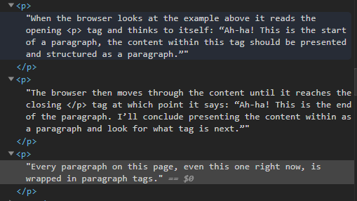
When the browser looks at the example above it reads the opening <p> tag and thinks to itself: “Ah-ha! This is the start of a paragraph, the content within this tag should be presented and structured as a paragraph.”

The browser then moves through the content until it reaches the closing </p> tag at which point it says: “Ah-ha! This is the end of the paragraph. I’ll conclude by presenting the content within as a paragraph and look for what tag is next.”

Every paragraph on this page, even this one right now, is wrapped in paragraph tags.

HTML from this page

Notice that every paragraph has three distinct parts:

  1. the opening tag: <p>
  2. the closing tag: </p>
  3. the content within the tag: This is a paragraph, hooray!

The correct syntax for a paragraph in HTML is an opening and closing tag wrapped around some content.

When this syntax is correctly written it is referred to as an element. Elements allow the browser to determine the type of content on the page and also help it to derive the meaning of the content (semantics).

This is a paragraph element: <p>Hello world!</p>
This is not a paragraph element: <p>Hello world!
This is not a paragraph element: Hello world!</p>
This is not a paragraph element: <p></p>

HTML Rules

HTML is not case sensitive

<p>This is a paragraph, hooray!</p> is the same as:<P>This is a paragraph, hooray!</P> is the same as
<p>This is a paragraph, hooray!</P> is the same as
<P>This is a paragraph, hooray!</p> is the same as`

It’s extremely bad form to use uppercase, and absolutely no one mixes capitals with lowercase.

My suggestion is to always use lowercase, otherwise, developers will look at you funny.

HTML tags must have the correct syntax

The examples below will not work:

<p>This is bad HTML
<p>This is also bad HTML</p
`<p>This is bad HTML<p>

Tags on their own are sort of meaningless, but when wrapped around content, like in the example above, they tell the browser: “Hey! Browser! Listen up, this is a paragraph! So you should make it look and act like a paragraph”.

The browser has no choice but to obey the instructions HTML gives it, and as such, displays and lets you interact with it as a paragraph.

HTML tag attributes

HTML tags can have attributes. These provide additional information about an element.

Attributes are always specified in the start tag and come in name/value pairs like target=“_blank”. Where target is the name and _blank is the value.

Here’s an example of a link with attributes:

<a href="www.danielpuiatti.com" target="_blank">This is my website!</a>

Here’s an example of a list with attributes:

<ul style="list-style-type:disc;">
<li>List item one</li>
<li>List item two</li>
<li>List item three</li>
<li>List item four</li>
<li>List item five</li>
</ul>

Attributes are always wrapped in quotes and must be contained within the start tag. These examples will not work:

<a href="www.danielpuiatti.com">My site <target="_blank" />
<a href="www.danielpuiatti.com" target=_blank>My site</>

Tag types

Since there are multiple content types on a website (paragraphs, lists, titles, links, etc.) you must wrap your content in tags for the browser to understand what each one is, otherwise, it has no way to know which is which. For example:

This content is a paragraph.

  • This content over here?
  • It’s different from the paragraph!
  • It’s a list!

And this? It’s a blockquote!

There are many HTML tags, each with a specific semantic meaning and proper syntax. w3schools has a fantastic guide on HTML tags. I recommend taking a moment to read up on the various types, some good ones to get started with: are lists, links, headings, and paragraphs.

Ok, I hope this post will help you understand how to read HTML and that you now have a better grasp of HTML syntax, semantics, and best practices.

Here’s a handy image I found that brings everything together from this post.

Image result for html element syntax
source: Wikipedia

If you are ready for the next step, I’d suggest reading my beginner’s guide to CSS basics: syntax, semantics and best practices.